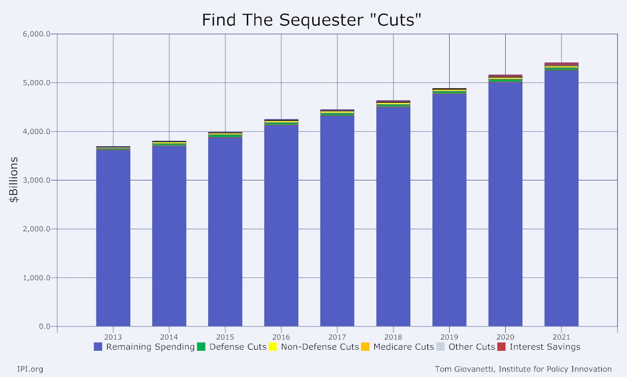
Here are a couple of charts that hopefully will provide some perspective on the relative insignificance of the sequester cuts. First chart shows total federal spending for the next ten years. The blue bars are how much the federal government will continue to spend, and how much spending will continue to grow, even with the sequester cuts. All the other colors represent the sequester cuts. They're hard to see because they are INSIGNIFICANT.

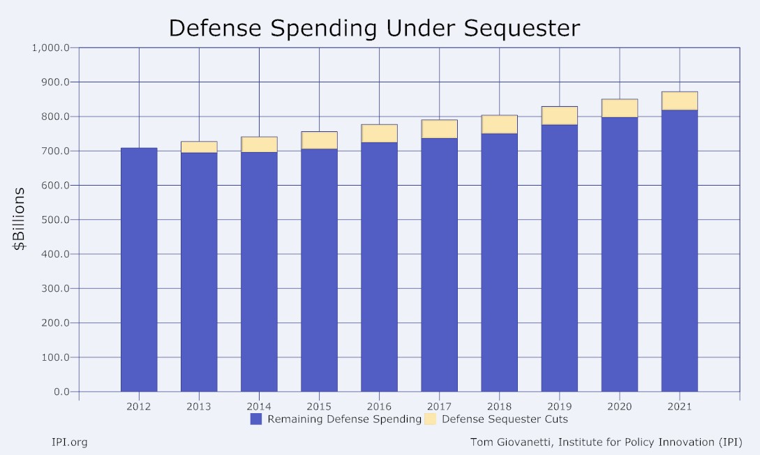
The next chart focuses on defense spending. Notice how little defense spending is reduced from 2012 levels, and how quickly defense spending catches up and continues to rise. Over the ten year sequester period, defense spending will grow 18% instead of 20%.


