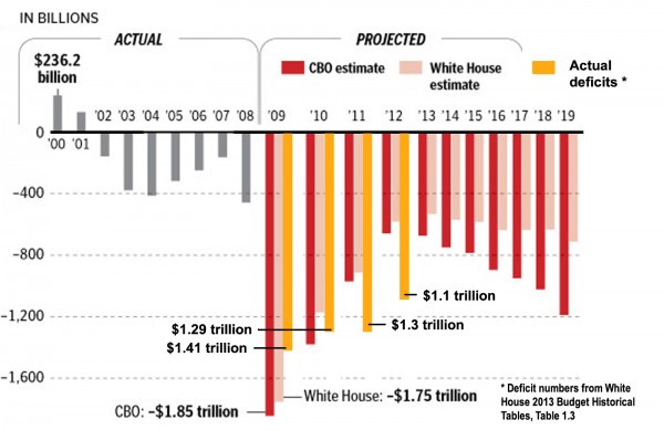
The accompanying graph, courtesy of Instapundit.com, pretty much tells the economic story facing the country. And it addresses a number of false budget accusations currently coming from the left.
President Obama likes to blame President George W. Bush for all the problems he inherited when he took office in 2009. For example, Obama claims he inherited the bills from two Bush wars that were never paid for. But as the graph shows, the annual budget deficits under Bush peaked in 2004 and began to decline, bottoming out in 2007 before beginning to rise again.

What changed in 2007? Democrats took control of House and Senate. But because the annual budget is passed the year before, the 2007 budget was a result of the Republican-controlled Congress in 2006.
In addition, in 2007 the federal government took in more money in one year than at any other time in history. That would be a year with the Bush tax cuts from 2001 and 2003 in place.
Come 2009 there was no budget; and there hasn’t been one since. We only have estimates.
Why the huge spike in 2009? A major reason was the $800 billion stimulus package, which only received a few Republican votes. However, the $700 billion TARP bill, which had bipartisan support, also played a significant role.
Notice also the Congressional Budget Office estimates begin to dramatically increase in 2014, while the White House estimates increase only slightly. But the White House estimates include a strong economy, the result of the president’s job-creating policies, plus some Obama tax increases.
Or not. The CBO is less optimistic on economic growth—and, of course, it isn’t trying to be reelected. Oh, and then there are the massive new costs associated with ObamaCare.
Any way you look at it, the graph is an indictment of four years of economic failure.
